plot(np.array([]))
def plot(
    x:ndarray, # Your data
    center:str='zero', # Center plot on  `zero`, `mean`, or `range`
    max_s:int=10000, # Draw up to this many samples. =0 to draw all
    plt0:Any=True, # Take zero values into account
    ax:Optional=None, # Optionally, supply your own matplotlib axes.
    ddof:int=0, # Apply bias correction to std
)->PlotProxy:
Call self as a function.
plot(np.array([]))
plot(np.full(100, np.inf))
np.random.seed(1)
x = np.random.randn(10000)+3
plot(x)
plot(x, center="range")
plot(x-3, center="mean")
plot(np.minimum(x-3, 0))
plot(np.maximum(x-3, 0), plt0=0)
# Very large outliers - don't print all sigmas

x2 = x.copy()
x2[0] = 1000
plot(x2, center="range")
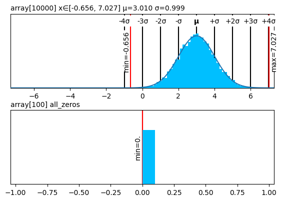
fig, (ax1,ax2) = plt.subplots(2, figsize=(6, 4))
fig.tight_layout()
plot(x, ax=ax1)
plot(np.zeros(100), ax=ax2);